 Design System (wip)
UX & UI
Design System (wip)
UX & UI
The client
The Sandbox is a community-driven platform where creators can monetize virtual lands, voxel assets & gaming experiences on the blockchain.
The project
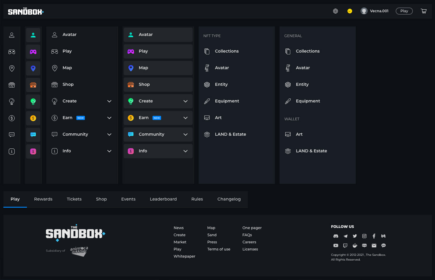
The Sandbox products lack a cohesive cross-product design system, resulting in disjointed experiences not only in the look and feel but also in confusing integrations throughout the products, creating inefficient workflows. These inconsistent experiences and visuals lead to frustration and confusion.
Design Approach
The team consists of Carla Grosso (prod. VoxEdit), Santiago Quinzan (prod. GameMaker), and me (prod. Website). Each product has a designer in charge of the full process, and each one of us is responsible for setting agreements. We define three phases.
OKRs: Objective, a balanced human & visual cross-product Design System. Key Results, create Personas, Logo system, and Design principles, refactor UI & Layouts per product, generate scalable documentation of DS with the support system.
Phase one: Set process for deliverables and presentations. Recap old documentation. Understand the mindset and motivations of personas and define them. Benchmark design systems. Create a logo system. Create design principles.
Phase Two & Three: Develop content guidelines and strategy. Define Style Guide per product and set agreements. Document existing UI per product and set agreements. Synchronize with developers/QA to create a roadmap to code new UI. Create or refactor UI and layouts per product. Document the website's Design System. Define how to support the system.
Products
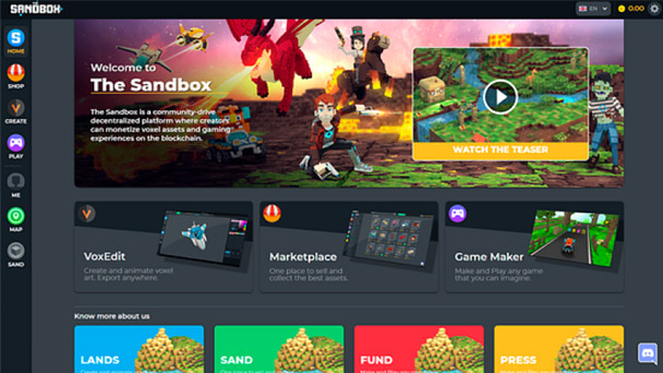
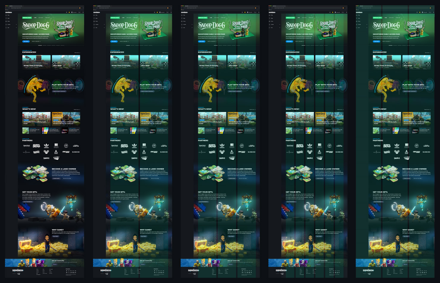
Website - The place where the ecosystem is connected.
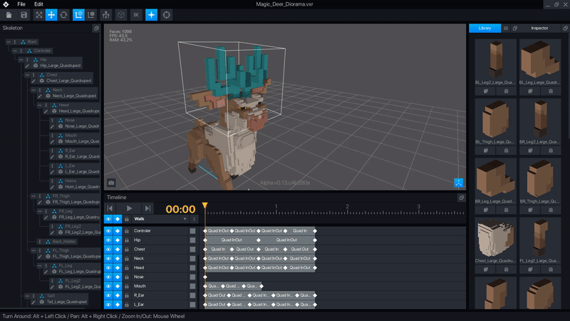
VoxEdit - Create, rig, and animate voxel-based NFTs.
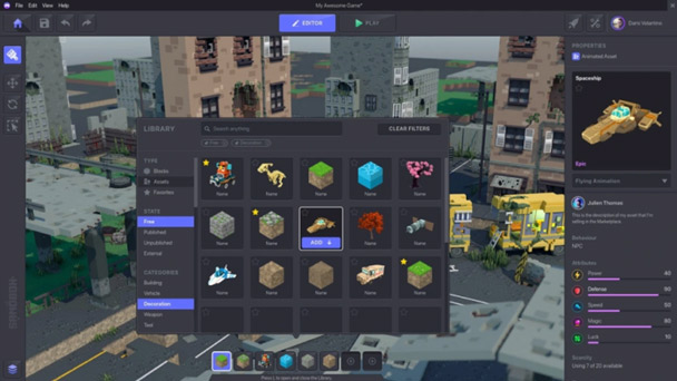
GameMaker - Design/Develop games, no coding required.
We have six hours per week to dedicate to this project while each designer continues working on their respective product.
Phase One
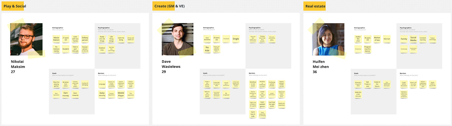
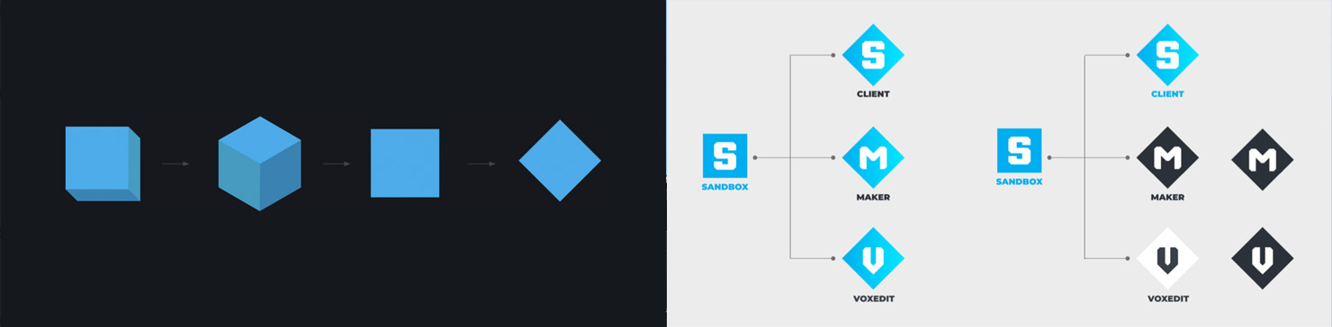
Personas new definitions, the creation of Design Principles and a Logo system and morphology (to respect the morphology in the brand identity, we opted for the variation of the rhombus to provide dynamism in the logo of the products).
Design Principles
To solve a problem always understand the objectives and outcomes.
Get a balanced Human & Visual Design.
Understand the mindset and motivations of personas.
Be Intentional about Static & Motional Design.
Validate & Iterate work with teammates.
Gather personas feedback/data to refine and improve work.
Phase Two
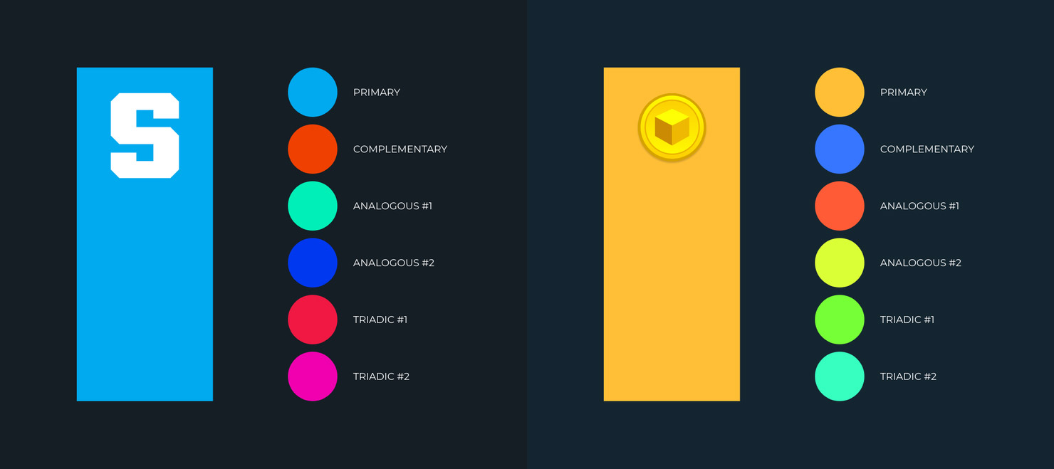
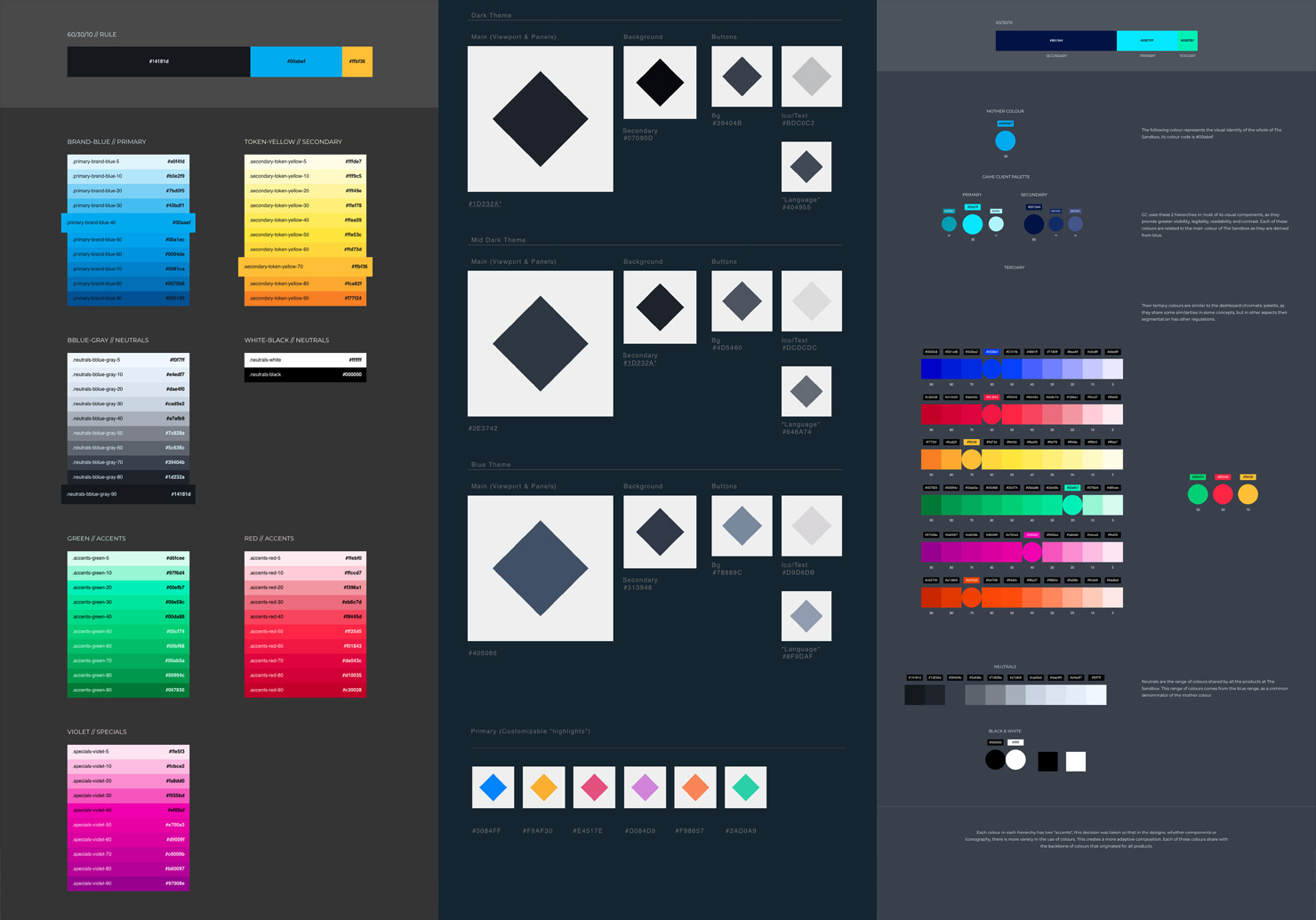
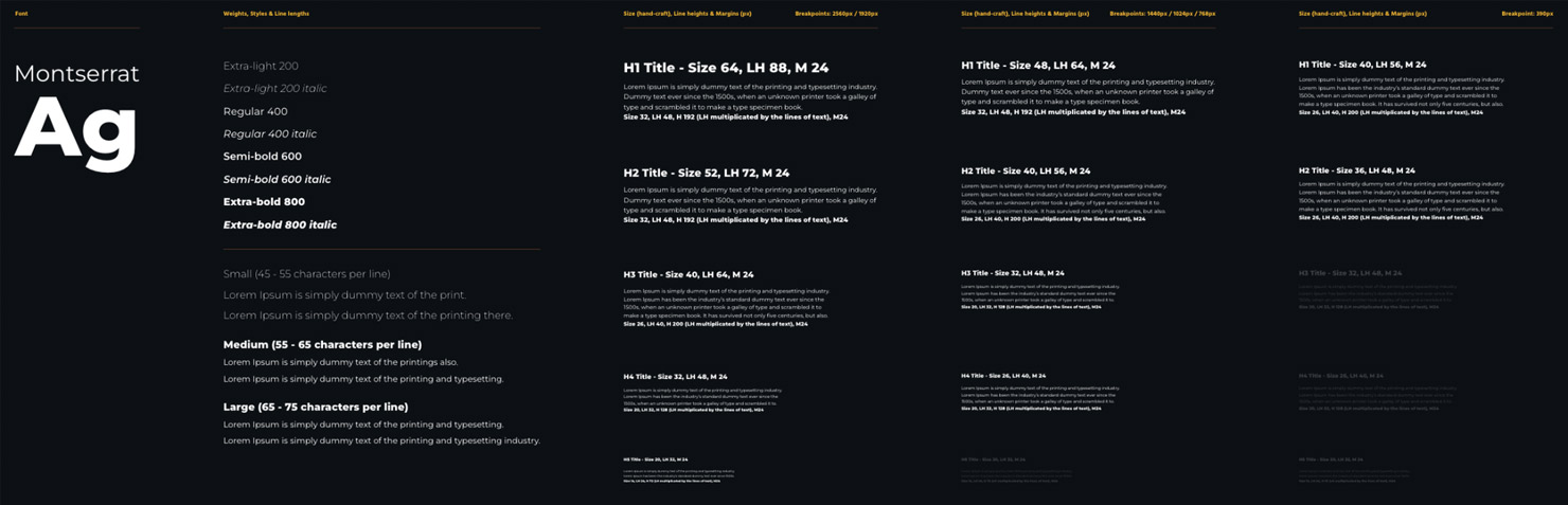
Defining Style Guide per product and setting agreements. We create a “Base Color Palette” based on the two main colors of the brand, after having the base palette we work on the palette colors for each product. We also define Typography treatment for titles, lead texts and paragraphs, Space, Grids and Layouts agreements.
...stay tune, more to come!